Our website is still in development, so some features may not be working quite right just yet. Thanks for your patience!
Case Study

Outerlands

Client:
Outerlands Capital
Deliverables:
  • Visual Brand Identity
  • Document Layout
Challenge:

The client has expressed a unique challenge for their branding, aiming to combine the conservatism associated with traditional asset managers with the excitement and innovation of a crypto/tech firm. Their goal is to create a brand that enhances their credibility.

Outcome:

Unique and credible brand that appeals to both traditional asset management clients and those interested in the crypto/tech space.

Process

Logo development

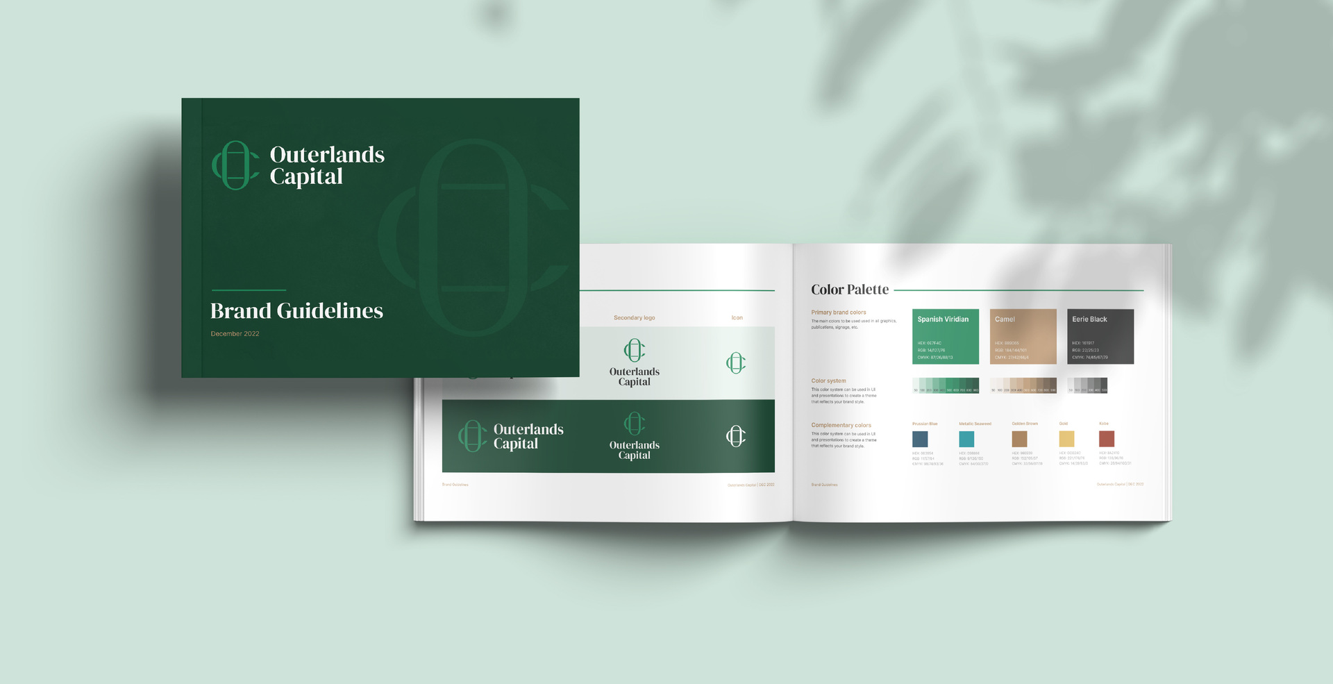
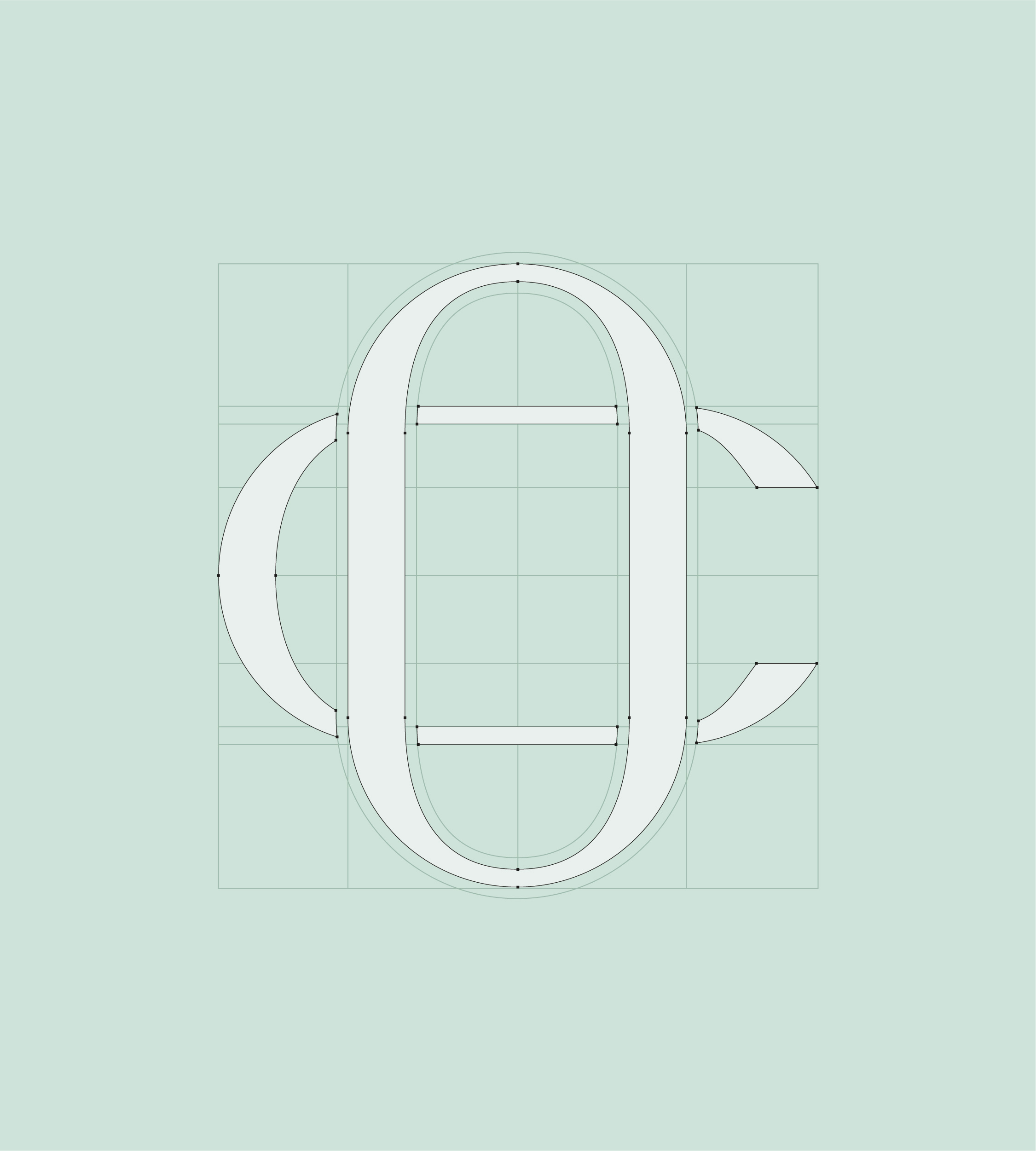
During the logo design process, we considered various shapes and forms that not only looked visually appealing but also captured the desired look and feel of the company. To convey a serious and professional visual brand, we chose darker colour shades that would also be suitable for graphs and tables in documentation.

Other brand materials

In order to support Outerlands in attracting their audience through high-quality research, we made sure to provide the team with essential brand elements to be used in their documentation. This included a carefully selected palette of colours and a set of templates that would enable them to maintain a cohesive and professional visual identity.

Outcome

The brand identity visually reflects a balance between conservatism and innovation. This has been achieved by using a combination of traditional colours and design elements, such as forest greens, with modern and dynamic elements like clean and sleek typography.

The Outerlands team expressed great satisfaction with the final outcomes.

You really took our vision for the brand and turned it into exactly what we wanted […]

Felix Stratmann

Head of Research at Outerlands Capital

Contact Us

Sometimes a quick chat is enough to see if we are a good fit for your upcoming project.

Contact
Hello